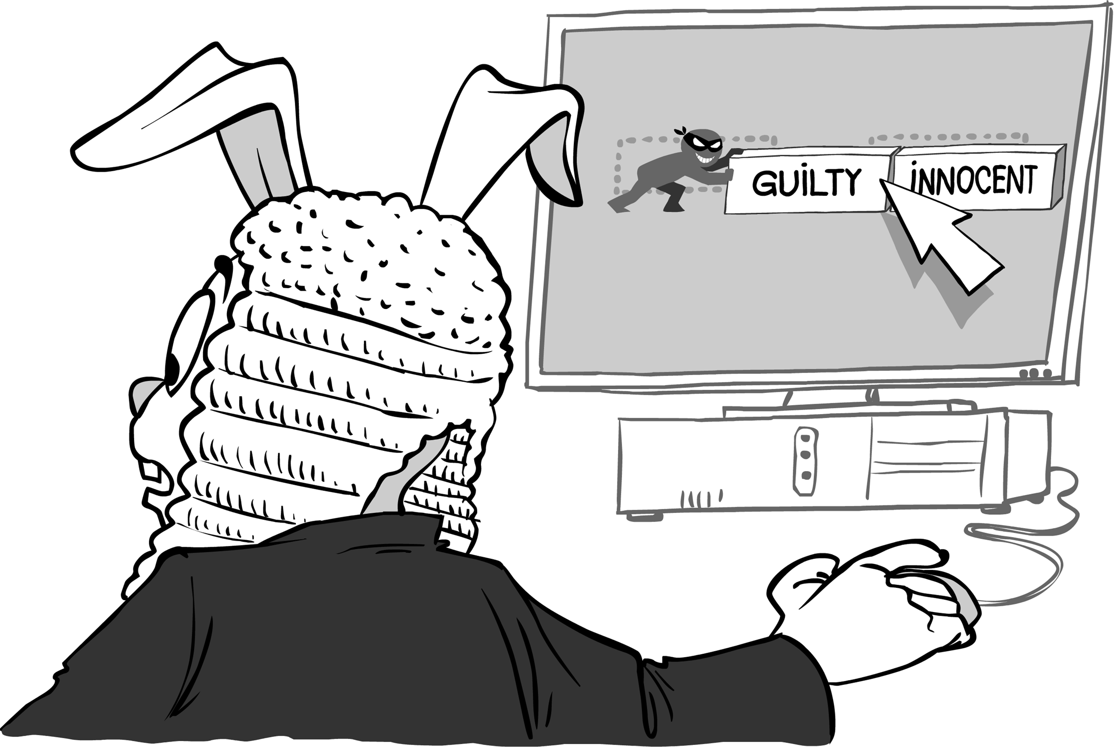
User experience specialists are sometimes regarded as superfluous people. Sergey Ignatchenko demonstrates why they can be vital.
Disclaimer: as usual, the opinions within this article are those of ‘No Bugs’ Bunny, and do not necessarily coincide with the opinions of the translators and Overload editors; also, please keep in mind that translation difficulties from Lapine (like those described in [ Loganberry04 ]) might have prevented an exact translation. In addition, the translator and Overload expressly disclaim all responsibility from any action or inaction resulting from reading this article.
The superfluous man (Russian: лишний человек, lishniy chelovek) is an 1840s and 1850s Russian literary concept derived from the Byronic hero. It refers to an individual, perhaps talented and capable, who does not fit into social norms. ~ Wikipedia
This article continues a mini-series on the people who’re often seen as ‘superfluous’ either by management or by developers (and often by both); this includes, but is not limited to, such people as testers, UX (User eXperience) specialists, and BA (Business Analysts). However, in practice, these people are very useful – that is, if you can find a good person for the job (which admittedly can be difficult). The first article in the mini-series was about testers; this article tries to show why do you need to have user interface (or more generally – User eXperience) specialists on your team.
UI nightmares
As a user, I hate poorly designed UI. I really, really hate it. Poor UI takes away my time (and the time of thousands and millions of other users), and simply because of somebody not spending 5 minutes thinking about it. Decent UI might be not rocket science, but it certainly does require a view from the user’s perspective – one thing developers (almost universally) and project stakeholders (sadly often) lack.
UIs designed by developers
Let’s take a look at some of the UIs designed by developers.
LibreOffice Writer ‘Find’ – strike 1
While I use LibreOffice all the time and think overall it is a decent piece of software, the ‘Find’ feature of LibreOffice Writer is quite annoying to say the least. This is how it works in LibreOffice 4.0 under CentOS Linux (on other platforms details might be different):
- I press Ctrl+F and it opens a ‘Search’ bar at the bottom of the screen
- The focus is already in the search box, so I can start typing right away. Good. I enter search the term, and press Enter – it finds the first occurrence of the search term. So far so good.
- Jumping through further search term occurrences can be done just by pressing Enter, which is good too.
- However (LO Problem 1), if I’m already at the last occurrence of the search term, LibreOffice shows a dialog box, asking if I want to continue search from the beginning (which is fine). The problem here is that the focus is not on this dialog, so to press ‘Yes’ I need to use the mouse . Hey folks, it is a Writer application, where most of the work is done (surprise!) with a keyboard, and moving a hand from keyboard to mouse for such a routine task is a waste of time. It means that we have a bit of poor UI here (and no, it is not fatal – just as with many other UI flaws – but when we sum every bit of time wasted, it translates into hours of unproductive activity).
- Another problem (LO Problem 2) is that to move to the occurrence of the search term in the text from the ‘Search’ box, I need to use the mouse again . Which is not that bad, but I’d still prefer to have the ‘Tab’ key go straight there (rather than to move to the ‘Find Next’ button, which is pretty useless for the user).
- And yet another problem (LO Problem 3) is that when I’ve already moved focus from the search box to the text window, the only obvious way to continue my search without using the mouse is to press Ctrl+F (to move the focus to the search box), and then to press Enter (to move to the next occurrence). This is three key presses (two for Ctrl+F, and one for Enter), and I’d certainly prefer to have a single one (for example, the fairly standard F3). For those who’ll say “Hey, there is already a hotkey XX” (which I wasn’t able to find, but it might still exist) – my answer is that “If there is such a hotkey, it should be shown when I’m hovering the mouse over the ‘Find Next’ button in the search bar, so I can learn about it without Googling it”. For those who says “ Hey, you can configure all the hotkeys you want in the Tools > Customize menu ” (I wasn’t able to find this specific function there, but once again, it might still exist) – I will note that such an obviously necessary function should be pre-configured by default.
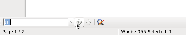
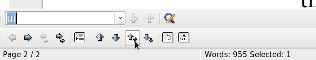
- However, all these problems are mere peanuts compared to the Big One (LO Problem 4). If I gave up staying with the keyboard and conceded to use the mouse (as a result of carefully crafted LO Problems 1–3), then there is one more surprise, and a very nasty one. If I click on the ‘Find Next’ button to find what I need, and the next occurrence of the search term is within a bulleted list, then all of a sudden, another bar (to manage the list) appears below the search bar, moving my search bar and ‘Find Next’ button up. Therefore, if I’m clicking ‘Find Next’ in a quick succession (and looking into the text window), another button (which is ‘Move Up with Subpoints’) appears right under my mouse, and I can click it without even realizing that I’ve just changed my document!
LO Problem 4 is illustrated in Figure 1 and Figure 2.
|
| Figure 1 |
|
| Figure 2 |
As you can see, position of the mouse on both screenshots is exactly the same, but the button underneath has changed...
This kind of things (when a potentially dangerous button appears in place of a very harmless one) is a Big No-No in UI design (and the fact that it – as well as all the other poor UI manifestations – happens all the time, is not an excuse). In the case of LibreOffice, the fix for this particular problem is trivial – to get rid of it, it is sufficient to move all ‘read-only’ bars (such as the ‘search’ bar) below ‘modifying bars’ (such as the ‘bullet list’ bar). However, to fix the problem somebody should have spent time discovering that the problem exists in the first place, which apparently didn’t happen here.
Now let’s ask ourselves the question – why did these problems occur? I suggest that there are two reasons. The first is that it was technically simpler to implement it this way. While LO Problem One is about keyboard focus, which is always a headache to deal with properly, LO Problem 2 is about overriding the default behavior of the Tab key (and leaving it at default is always simpler), LO Problem 3 is about doing something instead of doing nothing, and LO Problem 4 is relying on one generic concept (that of ‘stacked bars’) without thinking about potential interactions between those bars. On the other hand, it is certainly not rocket science to fix these issues. OK, it might take a few hours to fix problems 1–4, but it is nothing compared to amount of work thrown into LibreOffice, and it would improve usability by a significant margin.
The second reason is that there is nobody on the development team who is responsible for making the software convenient for the user, and/or having enough influence to make developers do it. Without someone who advocates the needs of the user (against the natural need of developers to implement the function as simply as possible), all the good intentions to make good, usable software for the end-user won’t materialize.
As a side note: a potential argument “hey, it is free software, so you cannot complain about it” doesn’t really fly. If you folks want your software to be used, you should care about your end-user, whether the software is free or not. Of course, software being free as in ‘free beer’ does indeed help people to accept it, but doesn’t guarantee acceptance at any rate; crappy free software will lose to good commercial software, whether we like it or not.
Windows MessageBox() – strike 2
The road to hell is paved with good intentions ~ proverb
Our next example of atrocious UI design touches an (in)famous Win32
MessageBox()
function. For those few who don’t know it, here is its prototype:
If you haven’t seen it before, you’ll ask yourself – hey, how does it know which buttons are to be shown? Apparently, buttons are ‘conveniently’ hidden behind that
uType
parameter, as something like
MB_YESNOCANCEL
, which specifies 3 buttons – ‘Yes’, ‘No’ and ‘Cancel’– or as
MB_OK
with one ‘Ok’ button, or as
MB_ABORTRETRYIGNORE
etc.
Now let’s see in which direction this API pushes developers. As the API doesn’t allow you to specify exactly the buttons you need (and creating your own message box with your own buttons, while possible, is quite a lot of work), Windows software is full of message boxes with text like the following:
If you want to save file before closing the window, press Yes. If you want to discard the changes you’ve made since last save, press No. If you want to keep editing, press Cancel.
It would be much more user-friendly to make it three buttons ‘Save File’, ‘Discard Changes’, and ‘Keep Editing’ – and avoid the potential for confusion and mistakes, but the
MessageBox()
API encourages developers to push complexity towards the end-user. No wonder developers are going down this road (obviously paved with good intentions by whoever designed the
MessageBox
API).
But I’m not done yet with presenting my evidence against
MessageBox()
. The real fun starts when your software is running on non-English Windows. In this case, Windows ‘conveniently’ replaces ‘Yes’, ‘No’, and ‘Cancel’ with their translated versions (while your software, unless you’ve spent quite an effort translating it, remains in English). This often leads to such message boxes as the one in Figure 3.
|
| Figure 3 |
I rest my case.
Fax machine UI – strike 3, developers out
Bad UI is certainly not restricted to PCs. One of the most ridiculous UIs I’ve seen was on a fax machine. If you ask yourself – what can be so bad about the UI of a fax machine – I will name just a few (mis)features of the machine. It was so bad that I don’t want to name the company that made it, because the same company produces very usable printers, which I like a lot; I hope that they will learn from their mistakes. So, here goes the list of (mis)features:
When the fax I was sending didn’t go through, two things could have happened (and the difference between the two cases wasn’t obvious at all to me as the user; one time it went one route, another time it went another way for no apparent reason).
-
In the first type of failure, the fax machine produced a sound which was enough to awake a nearby cemetery (and of course, none of the volume controls was able to affect it), and then it just considered the job done.
To find out if the fax was successful or not, I needed to be near the machine. If I was away, it blinked three times with the error message, and then went to the idle state, leaving me, when I came back, wondering if the fax had gone through or failed. How it should be implemented (and actually is implemented on a competing fax machine from a different manufacturer) is that the status should blink, at least until the user interacts with the machine.
To re-submit the fax, I needed to feed it through the machine once again. The machine was implemented as a scanner+printer, and by the point of failure, the fax had already been scanned. In the process of scanning it had already passed through the machine, but the machine in its infinite wisdom has decided to discard results of the scan in this particular case, so I needed to take the pile of paper and put it into the feeder again.
-
In the second type of failure, there was no sound, and again the message blinked only three times. It appeared that in this second case, the fax machine has realized that the problem is transitory, and that it should retry the fax some minutes later. So far so good, but:
- on the front panel of the machine there was no indication whatsoever that the machine has some fax in memory
- in fact, the only place where you can find out what happened with your fax, was three levels deep into the fax machine menu, with one of the levels aptly named ‘MEMORY SETTINGS’ (this obviously was made to make sure that there is no chance to operate the machine without the manual).
Overall, the machine was such a nightmare, that when a lightning strike put the machine out of its misery, I was really grateful for this Act of God.
| Act of God | |
|
Once again, the reason for this UI was two-fold: first, it was technically simpler to do it like this, and second, there was nobody to represent the end-user and to advocate her interests.
In general (and as it has been observed in these three examples), developers are not good at designing UIs. Personally, I feel that this is because when designing the UI, a developer is inherently in a position of a severe conflict of interest: on the one hand, he needs to finish the job fast (and to move on to implementing other features), and on the other hand, user interests may require spending another few hours before moving ahead. In theory, this conflict of interest should always be resolved in favor of the end-user (for example, based on the logic from [NoBugs11] ), but in practice, more often than not, developers ignore the end-user at least to some extent; in extreme cases, it results in really atrocious UIs (like our last two examples).
UIs designed by project stakeholders
Ok, developers are not good in writing UIs. But what about project stakeholders? They should know what is good for the user, right?
Unfortunately, the answer is “not necessarily”. In many cases, it works well (especially if stakeholders are end-users themselves), but in many other cases, it doesn’t. And if things go wrong with stakeholder design decisions (especially if stakeholders have had a Big Idea which overrides everything else, including common sense), the consequences can easily be on the much larger scale than that of developer-designed UIs.
QuickTime Player 4 – strike one
Back in 1999, with QuickTime Player 4.0 UI, Apple had a Big Idea to mimic a physical media player on-screen. And their developers have faithfully implemented this idea. Which, apparently, turned out to be barely usable. [AskTog99] [HallOfShame99] As ‘the interface hall of shame’ has put it: “ In an effort to achieve what some consider to be a more modern appearance, Apple has removed the very interface clues and subtleties that allowed us to learn how to use GUI in the first place. Window borders, title bars, window management controls, meaningful control labels, state indicators, focus indicators, default control indicators, and discernible keyboard access mechanisms are all gone. ” [HallOfShame99] Worse than that, at that point Apple has just repeated the same mistakes IBM has made with their RealThing software a few years earlier. Strike One.
20+-field forms – strike two
One thing which project stakeholders (especially in a commercial project) are notoriously bad with is requirements for more and more information. The Big Idea here is that you cannot possibly have too much information.
Let’s see how a ‘sign-up’ or ‘registration’ form is usually designed in a medium-to-big company. First, business comes in and says, “ We need to know a user name and e-mail ”. Then the marketing department adds, “ Hey, we also need to know address, gender, and food preferences ” (not specifying if it is ‘gender’ and ‘food preferences’, or ‘gender preferences’ and ‘food preferences’). And last but not least, the legal department adds a dozen required fields such as ‘legal name’, ‘domicile’ (which nobody except them understands anyway), ‘VAT number’, and ‘I hereby certify, under a penalty of perjury, that I am do not intend to perform terrorist acts using any of the web sites belonging to <insert organization name here>...’.
As a result, a simple sign-up form becomes a 20+-field monster, which literally scares the users away (in business terms, it is characterized by a ‘drop-off rate’). It is amazing how many businesses don’t realize how much harm can be done to their business by such a form. Just one example with A/B split testing is provided in [ VWO12 ], and has shown that removing 3 fields from a sign-up form increased the number of customer registrations by 11% (!). It means that those 20+-field monster forms are effectively killing the very same departments which fight over the right to insert another field into sign-up form. At the very end, the approach described above will lead to a 50+-field form, and many-fold increase in number of people who’re dealing with the statistics derived from this form; the only problem will be that there is no statistics, because there are no users.
Strike Two.
Windows 8 – Strike 3, stakeholders out
Windows 8 stakeholders have had their own Big Idea behind the new redesigned UI – to make the UI consistent between desktop and cellphone. And Windows 8 is actually not all bad – that is, if you have a laptop with a touchscreen. However, if you don’t have a touchscreen (and 98+% people don’t even now, over 2 years after the Windows 8 release) – it is an outright disaster. It is that bad that it is often compared to the ‘New Coke’ marketing disaster back in 1985, and that was a really bad one from a business perspective.
| New Coke | |
|
While the Windows 8 UI is a subject which is easy to write another five pages about, I feel that most of the readers have already formed their own opinion about it, so I won’t go into floor-mopping with Windows 8 Metro UI once again (it has already been done on numerous occasions).
Strike Three, Stakeholders out.
What is to be done?
“What is to be done?” ~ The name of the novel by Nikolai Chernyshevsky
So, we’ve found that developers very rarely produce a good UI, and stakeholders, while having good ideas from time to time, are prone to certain very costly mistakes (which originally looked like The Next Big Thing).
At this point, our natural question is, “What can be done about it?” The answer is simple – you need to appoint somebody whose responsibility it is to advocate the end-user point of view.
Such a person needs information on “how usable our UI is” to do their job – and there are multiple sources for it. One such source of information can be the QA department (and they should be encouraged to file “usability defects”); another source of such information can be user forums (if any) and complaints (if you don’t have them, your project is either very new, or is in deep trouble); and yet another source are the people using the software on a daily basis.
And as a last (but certainly not least) source of information about usability – you can (and I’d say, if you’re targeting more than a 1000 customers, should) have an UX specialist on the team.
UX specialists – are they any good?
As usual, when you’re faced with a suggestion to hire yet another specialist, there is a natural question – are they any good for the project? And as usual, it is not all black-and-white, and there are good UX specialists, and there are not so good ones.
I’ve worked with a few UX specialists and was amazed by the things they’re able to do. A good UX specialist goes far beyond just trying to use software and saying, “Tsk-tsk, it is not good”. And they go far beyond designing a usable UI based just on their own aesthetic perceptions.
Among the UX projects I’ve seen personally was a project optimizing software for a stock exchange. To do it, they took a control group (several traders in a real-world environment), and monitored them for several hours. This monitoring involved not only the distance of mouse travel (with relation to the operation being done), but also patterns of eye movements during the process. This information allowed not only optimal positioning of the buttons (which is related to mouse movements), but also optimal positioning of the critical information (which is related to eye movements). While it wasn’t immediately clear how much money this research has made for the company, it was clear that the software is an undisputed ‘light years ahead’ leader in terms of customer satisfaction.
Another project I’ve seen, was a much simpler one, aimed to optimize user sign-up process. As a result of the UX review, a funnel analysis, a few studies on a target group, some A/B split testing, and a few months of fighting with different departments, the number of fields on the form was reduced 3-fold, and the user drop off rate was reduced by 30% (ask your marketing department how much this is; for those who cannot ask them, a hint – it is HUGE).
| Funnel analysis | |
|
Caveat emptor
I don’t want to say that all those who claim they’re UX specialists are good. In fact, there are many examples of their failures too. One thing to ask yourselves when hiring an UX specialist company is the following: do they perform any analysis of the target audience (with trials, split testing, etc.), or do they just have their own design ideas (without any objective justification for them)? Do they have a way to monitor user satisfaction (via trials, or surveys, or anything else to that effect), or they just make a design and then they’re out of the picture? When you’re dealing with the first type of folks, chances are they’re good, but the second type can easily lead to an epic stakeholder-scale UI disaster.
Conclusions
In any project which has UI (and has more than 1 or 2 developers), you do need somebody to advocate end-user interests. It is very important to empower such a person to open bugs (‘usability defects’), to assign reasonably high priority to these bugs, and to ensure they are fixed.
If you can afford a dedicated UX specialist, and can find a good one – they can make a Really Big Difference for your software (and to your bottom line too).
Acknowledgement
Cartoon by Sergey Gordeev from Gordeev Animation Graphics, Prague.
References
[ AskTog99] ‘Apple Quicktime Player 4.0 a Real Dud’, Bruce Tongazzini, http://www.asktog.com/readerMail/1999-06ReaderMail.html
[ HallOfShame99] ‘quicktime 4.0 player’, The Interface Hall Of Shame, 2011, http://hallofshame.gp.co.at/qtime.htm
[ Loganberry04] David ‘Loganberry’, Frithaes! – an Introduction to Colloquial Lapine!, http://bitsnbobstones.watershipdown.org/lapine/overview.html
[ NoBugs11] Sergey Ignatchenko, ‘The Guy We’re All Working For’, Overload #103.
[ VWO12] ‘Removing 3 form fields increases customer registrations by 11%’, vwo.com, https://vwo.com/blog/ab-testing-form-fields-increase-conversions/
[Wikipedia1] https://en.wikipedia.org/wiki/Act_of_God
[Wikipedia2] https://en.wikipedia.org/wiki/Funnel_analysis